How Website Structure Impacts User Confidence
By Dawn Bowman
Your website’s navigation just told someone you’re disorganized. Your footer convinced another visitor that you don’t care about details. A third person left because they couldn’t figure out if you actually offer what they need.
None of them will tell you this happened.
Website structure acts as a silent salesperson who never takes a day off. When it’s good, nobody notices. They just buy. When it’s bad, people simply leave. They won’t fill out a form explaining why. They’ll just go to your competitor.
A well-structured site lets users move without stopping to figure things out. Pages connect in ways that make sense. Navigation stays consistent. Content appears where users expect it. When those basics hold, visitors feel comfortable exploring, sharing details, and taking next steps.
This article looks at how structure influences confidence, why small choices matter, and how to adjust what you already have to earn trust faster.
Clear Navigation Hierarchies Reduce Uncertainty
When someone can’t figure out your menu in five seconds, they assume the rest of their experience will be just as frustrating.
Research backs this up: Half of consumers abandon websites when navigation confuses them. They don’t troubleshoot. They leave.
Think about your own navigation as a decision tree. Every click should narrow down options, not expand them.
Here’s how to achieve that:
- Start with broad categories in your main menu (Products, Services, Resources, etc.).
- Under each, create subcategories that make logical sense.
- Avoid clever labels that require interpretation. “Solutions” means nothing, while “Website Design Services” tells people exactly what you offer.
- Audit your current navigation by asking someone unfamiliar with your business to find three specific things on your site.
- Watch where they click. If they hesitate or guess wrong, your hierarchy needs work.
- Group related pages together.
- Limit your main menu to five to seven items.
- Use dropdown menus sparingly – only when subcategories genuinely fit under a parent topic.
An example of this approach is Golf Cart Tire Supply, a niche retailer selling golf cart tires and accessories. Their Golf Cart Wheels and Tires category page serves as a primary hub.
Upon entering, the page immediately presents two prominent, clickable options: “Non-Lifted Combos” and “Lifted Cart Combos.” These are the secondary pages. This unambiguous split guides the user, eliminating hesitation. Someone looking for lifted tires isn’t forced to scan through non-lifted tires, and vice versa.
The hierarchy is visually obvious, making the journey from a broad product type to a specific selection feel effortless and reliable.
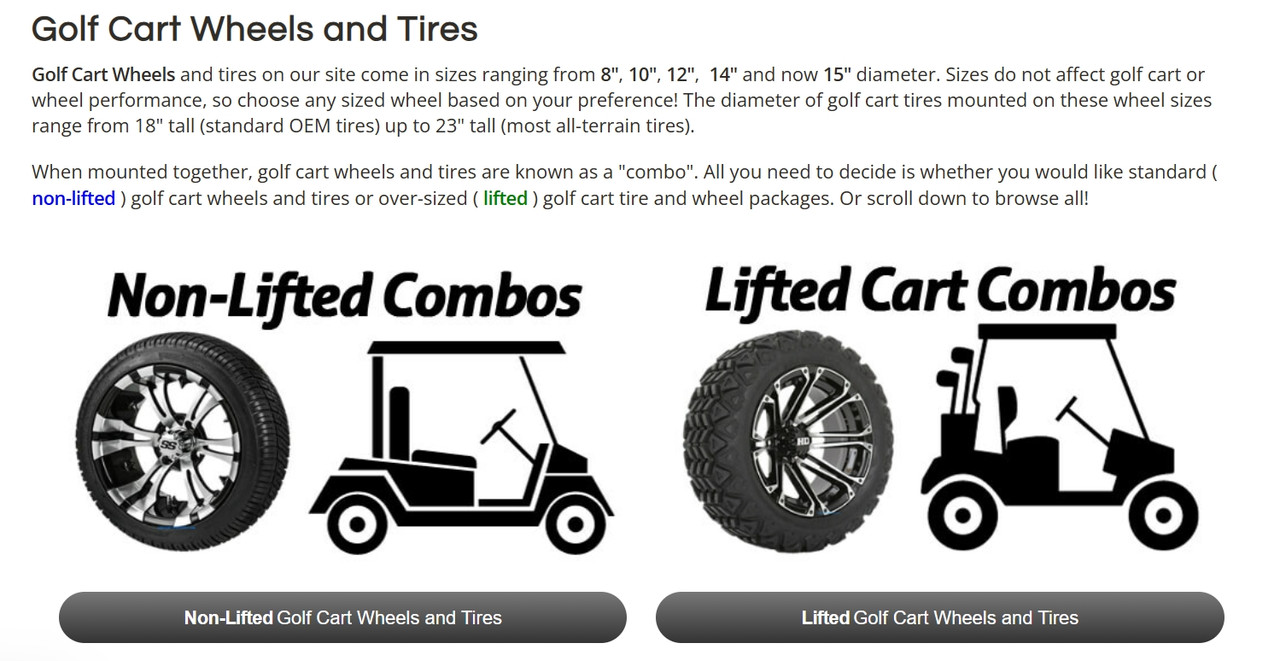
Source: golfcarttiresupply.com
Logical Page Flow Signals Intentional Design
Random content blocks stacked on a page tell visitors you threw everything at the wall to see what sticks. Intentional flow tells them you’ve thought through their journey.
The difference shows up in how long people stay and whether they take action.
Your page structure should match how people actually make decisions.
Here’s how to achieve that:
- Start with what they need to know first, then layer in supporting details.
- For service pages, lead with what you do and who it’s for. Follow with how it works, then prove it delivers results.
- Product pages need specs and benefits upfront, social proof in the middle, and pricing and guarantees near the end.
- Map out the questions someone asks themselves when considering your offer, then answer them in that order.
- Pick your most important page and screenshot it. Print it out if you can. Draw boxes around each section and number them.
- Now ask yourself: Does this order make sense for someone who knows nothing about you? Would moving section four above section two create a smoother path to understanding?
- Rearrange until the flow feels natural, not forced.
Brain Ritual, a brand offering science-backed supplements for migraine management, executes this perfectly.
Their homepage follows a logical sequence. It opens with the core value proposition, immediately backed by trust signals, ratings, and a brief video explaining benefits. When you scroll down, you’ll find ingredient breakdowns, clinician evaluations, customer reviews, competitor comparisons, company values, and FAQs.
Each section builds on the last. By the time someone reaches the bottom, they’ve moved from “What is this?” to “Why should I trust this?” to “How do I buy it?”
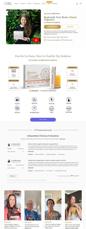
Source: brainritual.com
Well-Structured Headers Confirm Users Are in the Right Place
People judge your entire business based on what they see in the first few seconds. Studies show web design influences 94% of first impressions.
Headers play a bigger role in that judgment than most site owners realize. When someone clicks to a new page, and the header confirms they’re exactly where they meant to go, confidence builds. When it doesn’t, doubt creeps in.
Here’s how to achieve that:
- Treat headers as signposts, not opportunities for creativity.
- Your main header should tell people what page they’re on without requiring thought. “About Us” beats “Our Story.” “Residential Plumbing Services” beats “What We Do.”
- Use subheaders to break content into scannable chunks that answer specific questions.
- Rewrite headers to be concrete and descriptive.
- Remove vague language.
- Make sure your navigation labels match your page headers. Clicking “Services” should land on a page titled “Services” or “Our Services,” not something unrelated.
Sewing Parts Online gets this right for a business selling sewing machines, parts, and supplies. Their menu bar lists actual product categories, which is exactly what customers want when they arrive.
The header includes a search bar that filters by brand, model, and part type, letting people narrow options immediately. Click into any category, and you’ll find a brief header confirming where you landed and describing what’s in that section.
This leaves no confusion about whether you’re looking at the right products. Just clear confirmation that you’re on track.
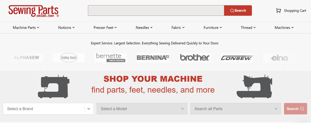
Source: sewingpartsonline.com
Consistent Layouts Create Predictability and Trust
Your brain loves patterns. When a website keeps changing its layout from page to page, your brain has to work harder to process what it’s seeing. That extra effort registers as friction, and friction kills trust.
Companies that maintain consistent branding (including layout consistency) see revenue increases of up to 33%. People buy from brands that feel reliable, and reliability starts with predictable design.
Consistency doesn’t mean that every page looks identical, but that the layout follows the same basic rules.
Here’s how to achieve that:
- If your product images appear on the left on one page, they should appear on the left everywhere.
- If you use a sidebar for filters, keep that sidebar in the same position across all categories.
- When buttons, forms, and CTA elements stay in familiar spots, visitors stop thinking about navigation and start focusing on content.
- Map your current pages side by side.
- Look at where key elements sit (headers, images, sidebars, buttons, product grids, etc.).
- Note where things shift around without reason.
- Create a layout template for each page type (product category, individual product, service page, blog post, etc.) and stick to it.
- Small variations are fine for emphasis, but your core structure should remain stable.
Pergola Kits USA, a business selling ready-to-assemble pergola and pavilion kits, demonstrates this well. Visit any product category, like their wood gazebo kits, and you’ll see the same layout pattern.
A header confirms the category with a brief description. Products display on the right. A left sidebar suggests related categories.
Click into another category, and the structure repeats. This way, users learn the layout once, then navigate confidently everywhere else. There’s no reorienting, no hunting for filters, or trying to remember where products appear. Just a familiar, predictable design that lets people shop without thinking.
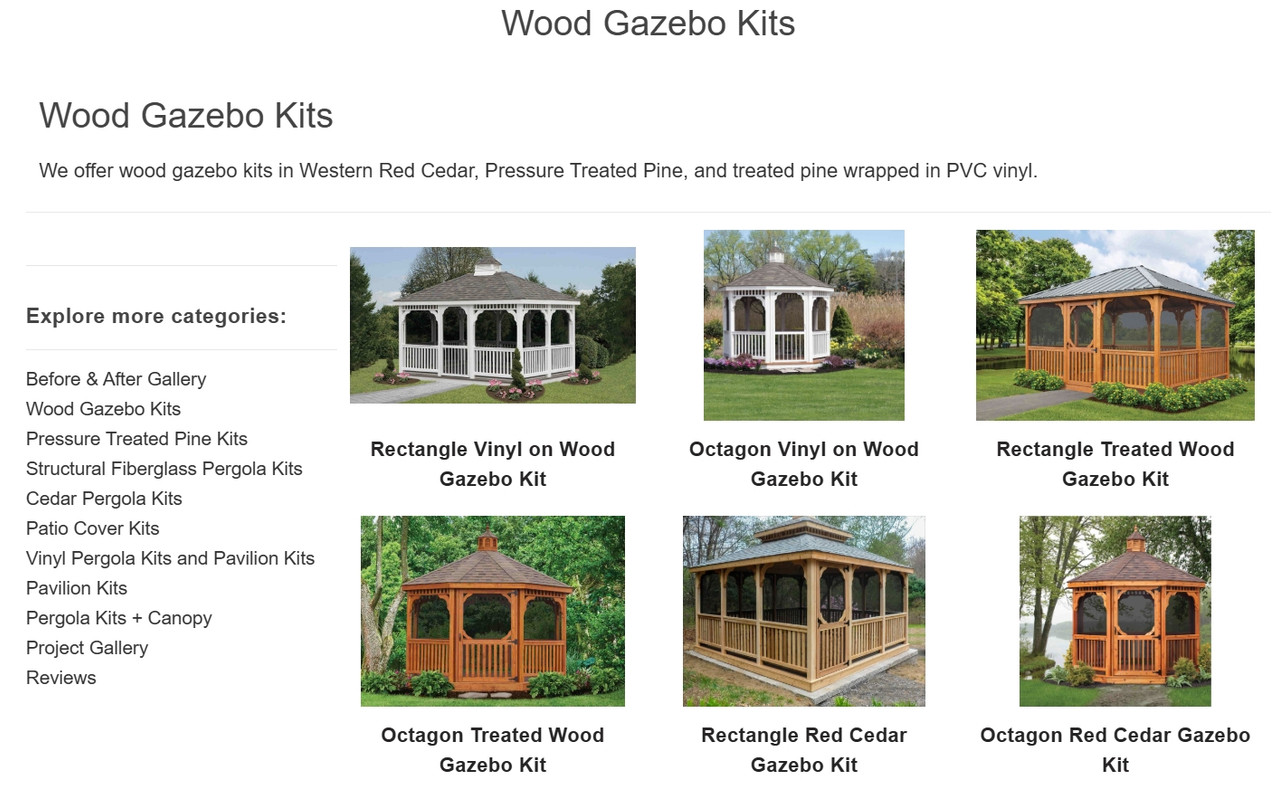
Source: pergolakitsusa.com
Clear Page Priorities Show What Matters Most
When everything on your page screams for attention, nothing gets it. Visitors arrive with a specific goal: Find a product, understand a service, get pricing, or purchase.
Your job is to make that goal easy to accomplish by putting the most important information front and center. If you bury it behind unnecessary content, people will assume you’re either disorganized or deliberately hiding things.
Visual hierarchy guides eyes to what matters. Bigger elements draw attention first. Position determines importance. What sits at the top gets seen, while what’s below the fold often gets ignored. White space around an element makes it stand out.
Here’s how to achieve that:
- If your main goal is getting people to browse products, show products immediately.
- If it’s booking consultations, make that form or button impossible to miss.
- Audit your key pages by asking what action you want people to take.
- Then look at what actually dominates the screen.
- If your newsletter sign-up takes up more real estate than your core offer, you’ve got priorities backwards.
- Shrink or remove elements that don’t support the main goal. Expand and elevate what does.
- Test by showing your page to someone for three seconds, then asking what stood out. Their answer reveals your actual hierarchy, not your intended one.
Mannequin Mall, a fashion mannequin retailer, handles this well. Their mannequins category page opens with quick trust signals and a brief description. That’s just enough to confirm you’re in the right place and can trust what you’re seeing.
Immediately after, the product listings take center stage. A clean sidebar allows filtering without pulling attention away from the products.
This layout shows users what matters most and lets them act with confidence, without unnecessary steps or distractions.
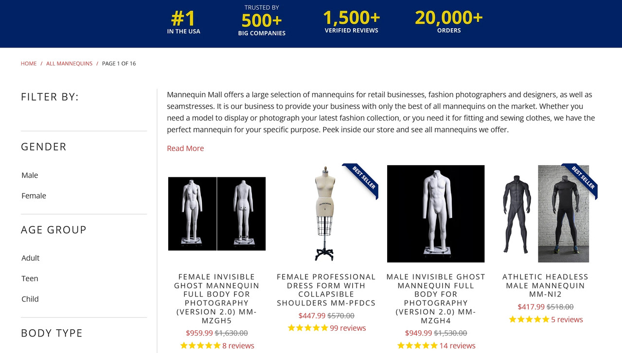
Source: mannequinmall.com
Organized Footers Reinforce Trust
Most people scroll to the footer when they’re looking for something specific, like contact info, shipping policies, return details, or social proof.
A messy footer signals you don’t care about details. A well-organized one reassures visitors that you’ve got your act together, even if they never click anything in it.
Your footer should function as a safety net.
Here’s how to achieve that:
- Group links logically. Company information should stay in one column, customer service in another, and products or services in a third.
- Include what people actually look for. That’s usually contact details, shipping and return policies, privacy policy, and social media links.
- Add a newsletter sign-up if email’s part of your strategy, but keep it simple.
- Avoid cramming everything you couldn’t fit elsewhere into your footer.
- Review your footer on both desktop and mobile. Check if links work. Verify that contact information is current. Remove outdated promotions or irrelevant pages.
- If your footer spans more than four columns on desktop, you’re probably overdoing it.
- Ask yourself what someone needs to find quickly when they’ve scrolled to the bottom, then provide exactly that.
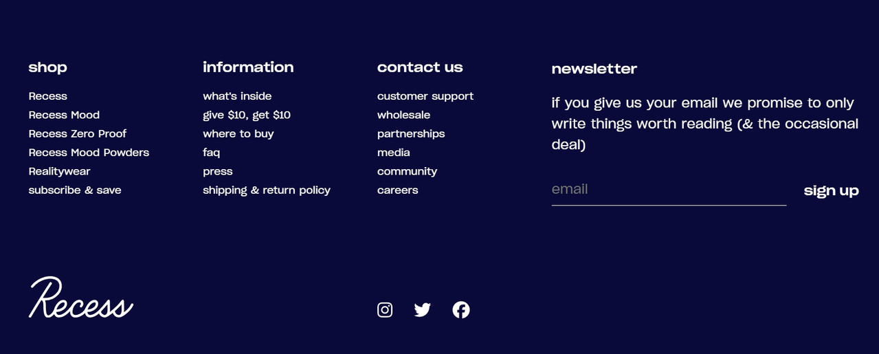
Recess, known for its adaptogen-enhanced sparkling waters, employs a footer that perfectly balances utility and clean design. It serves as a comprehensive, yet uncluttered, site map.
Users can quickly access their products, review FAQs, or read up on their ingredients. It includes a simple email sign-up field and prominent social media icons for connection.
This consistency across every page means that no matter where a visitor is in their journey, they have immediate access to every key resource. This thoughtful organization in the final stretch of the page experience solidifies trust, proving that the brand is thorough and user-focused from top to bottom.
Source: takearecess.com
Final Thoughts
Website structure shapes how people feel long before they decide what to do. When users feel oriented, they trust the information in front of them and move with less hesitation.
Strong structure doesn’t require complex design or constant changes. It comes from clear priorities, predictable patterns, and respect for how people think and browse. Small adjustments can remove friction, reduce doubt, and improve how users experience every page.
As generative search systems rely more on clarity and context, structure also supports visibility and understanding beyond the screen. Sites that guide users well tend to perform better across channels.
Confidence grows when a site feels intentional. Structure is how that intention becomes visible.
Learn more about Social Hire
The team at Social Hire won't just do social media management. Our team work closely with your team to ensure your business sees great value from the service and that your team gets tangible results.
What the Social Hire gang loves is making a difference for our clients, and we don't want to waste your, or our resources on marketing for marketing's sake, if it doesn't get your organisation the impression you need - we take a different approach.
Isn't it time to stop making difficult personnel choices that don't work well for your online marketing?
The social media marketers in our company are the best in the business at helping our partners enhance their online marketing. We outline and implement cutting-edge social media marketing plans that help our customers realise their organisational objectives and further their social media presence. Our experienced team of digital experts do your social media strategy creation and management in an uncomplicated monthly plan that is cost-effective and is genuinely useful, whatever results you demand from your marketing team.
We're a company that helps our customers further their social media presence by providing social media marketing on a monthly basis.
You might like these blog posts 5 Free Must-have Chrome Extensions for SMM!, 5 Ways How Content Marketing Drives Results for Small Businesses, 3 Social Media Marketing Tips to Maintain Visibility on Mobile Devices, and Social Media Marketing: The 4 Steps Small Businesses Must Embrace.